
John Wiedenhöft 2025-03-19
![]()
Kite-square plots (Figure 1) are a convenient way to visualize contingency tables, uniting various quantities of interest (Table 1). They get their name for two reasons:
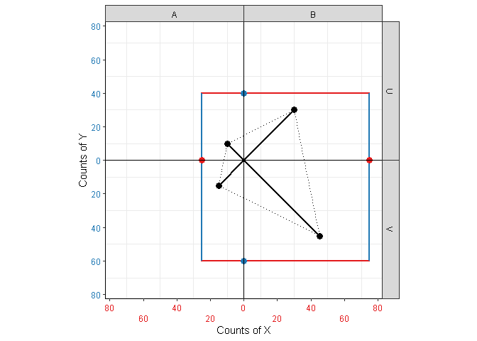
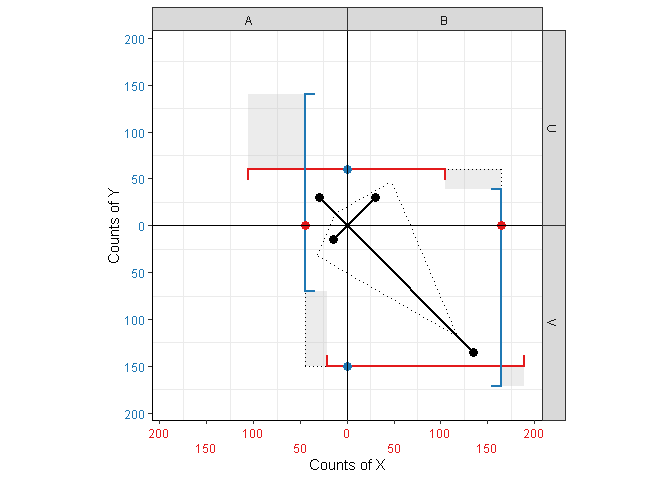
Figure 1: Kite-square plots for independent and dependent variables.
The R package kitesquare implements these plots using
ggplot2. It is available at https://cran.r-project.org/package=kitesquare as well as
https://github.com/HUGLeipzig/kitesquare.
The relationship between two categorical random variables, say \(X\) and \(Y\), is often displayed in the form of a contingency table (also known as a 2x2 table if both variables are binary). If the joint probability distribution is known, such a table comes in normalized form, with values between 0 and 1 (probabilities). Usually, these tables come in an unnormalized form, containing observed counts for different combinations of values, from which the probabilities are estimated as fractions.
From either form, a number of interesting and statistically relevant quantities can be computed (Table 1).
Table 1: Different quantities derived from contingency tables.
| quantity | unnormalized (counts) | normalized (probabilities, percentages) |
|---|---|---|
| marginal | \(M_X\) | \(\mathbb{P}(X)\) |
| expected joint | \(E_{XY}\) | \(\mathbb{P}(X)\mathbb{P}(Y)\) |
| observed joint | \(O_{XY}\) | \(\mathbb{P}(X,Y)\) |
| (observed) conditional | \(O_{X|Y}\) | \(\mathbb{P}(X|Y)\) |
Visualizing subsets of these quantities is easy. For instance, observed quantities are often shown using heatmaps, with each cell representing a unique combination of values of \(X\) and \(Y\). Conditional quantities are often shown using stacked or facetted barcharts (though visualizing both \(O_{X|Y}\) and \(O_{Y|X}\) in the same plot is challenging). However, combining all relevant quantities in a single plot is a different beast entirely. In addition, showing the dependence between the variables is often not a consideration (aside from adding p-values or \(\chi^2\) statistics as text), even though it is perhaps the most relevant quantity.
Kite-square plots attempt to solve these issues, displaying all relevant quantities in a sensible way while minimizing visual clutter, and providing a gestalt from which the user can quickly grasp the degree of dependence between the variables.
The following sections explain the visual elements of a kite-square plot in detail.
The corners of the kite (Figure 2 (a)) represent the theoretical, expected joint probabilities of \(X\) and \(Y\) if the two variables are independent, i.e. the product of the marginal probabilities. For count data, they represent the expected counts \(E_{XY}\).
The spars (Figure 2 (b)) represent the actual observed joint probabilities \(\mathbb{P}(X,Y)\) or counts \(O_{XY}\), respectively. The lengths of the spars are proportional to the observed quantities, and their values can be read off either axis at the position of the point.
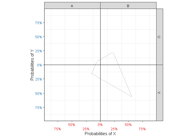
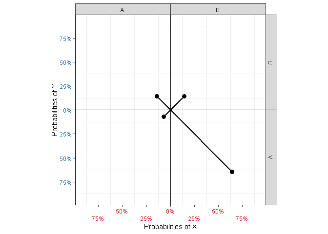
Figure 2: Elements related to joint quantities.
In the case of independence, the points are exactly at the corners of the kite, since \(\mathbb{P}(X)\mathbb{P}(Y)=\mathbb{P}(X,Y)\) in that case (Figure 1 (a)). Spars that stick out of the kite indicate observations higher than expected based on the marginals, and spars that stay inside the kite indicate values lower than expected (Figure 1 (b)).
The square (Figure 3 (a)) is comprised if line segments intersecting the axes at the value of their respective marginal counts or probabilities. For instance, the corners of cell \((X=A,Y=U)\) are defined at \((\mathbb{P}(X=A), \mathbb{P}(Y=U))\).
The end points of the bars (Figure 3 (b)) indicate conditional probabilities \(\mathbb{P}(X|Y)\) and \(\mathbb{P}(Y|X)\), respectively (or their count equivalent for unnormalized data). For instance, in the top-left cell \((X=A,Y=U)\), the blue bar represents \(\mathbb{P}(Y=U|X=A)\), while the red one represents \(\mathbb{P}(X=A|Y=U)\). Notice that the length of each bar is 1 (total probability).
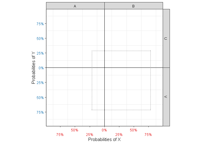
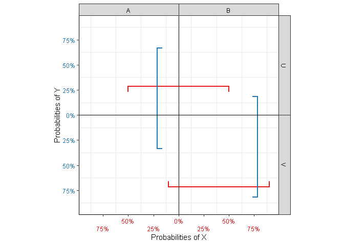
Figure 3: Elements related to conditional and marginal probabilities.
In the case of independence, the bars match the side of the square perfectly, since in that case \(\mathbb{P}(X)=\mathbb{P}(X|Y)\) and \(\mathbb{P}(Y)=\mathbb{P}(Y|X)\). As with the kite, bars sticking out of the square indicate higher values than expected (Figure 1 (b)), whereas bars that fail to reach the square’s corner indicate lower values. Note that due to its fixed length, the bar appears shifted towards the overfull cell.
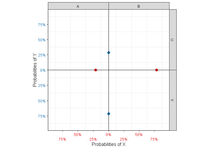
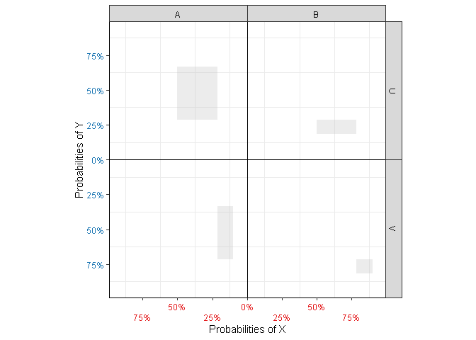
Figure 4: Additional plot elements.
Note that the axis labels are colored according to the bars with which they are associated. For clarity, kite-square plots have a colored point at the intersections of bars and axes, representing marginal probabilities/counts (Figure 4 (a)); notice that the intersections for \(X\) sit on the bars for \(Y\) and vice versa (Figure 1).
Intuitively, the discrepancy between the square and the bars provides a measure of association between \(X\) and \(Y\). It turns out that the area of the patches (Figure 4 (b)) representing that discrepancy is equal to \(N\chi^2\) for unnormalized and \(\frac{\chi^2}{N}\) for normalized data. This is because for
\[ \chi^2 := \sum_{\substack{X\in\{A,B\}\\Y\in\{U,V\}}}\chi^2_{XY} \] with
\[ \chi^2_{XY} := \frac{(E_{XY}-O_{XY})^2}{E_{XY}} \] we have
\[ \chi^2_{XY}= \frac{(N\mathbb{P}(X)\mathbb{P}(Y) - N\mathbb{P}(X,Y) )^2}{N\mathbb{P}(X)\mathbb{P}(Y)} \] \[ = \frac{N^2}{N} \frac{(\mathbb{P}(X)\mathbb{P}(Y) - \mathbb{P}(X,Y) )^2}{\mathbb{P}(X)\mathbb{P}(Y)} \] \[ = N \frac{\left(\strut\mathbb{P}(X)-\mathbb{P}(X|Y)\right)\mathbb{P}(Y) \left(\strut\mathbb{P}(Y)-\mathbb{P}(Y|X)\right)\mathbb{P}(X)}{\mathbb{P}(X)\mathbb{P}(Y)} \] and hence
\[ \chi^2_{XY} = N \left(\strut\mathbb{P}(X)-\mathbb{P}(X|Y)\right)\left(\strut\mathbb{P}(Y)-\mathbb{P}(Y|X)\right) \] In other words, the edges of each patch represent the difference between a expected (marginal) and observed conditional, and the area represents the contribution of each cell to the total \(\chi^2\). The larger the patches, the higher the degree of statistical dependency between \(X\) and \(Y\).
Creating kite-square plots in R is easy:
kitesquare(df, X, Y, count)The function kitesquare() expects a contingency table as
a data frame or tibble df in long form, i.e. one column for
each variable containing the different category labels, as well as a
column contaning counts (see
Table 2 for the
tables that generate
Figure 1). The second
and third arguments are the names of columns contaning the categories
for each variable. The fourth argument is the name of the count column.
The table may contain multiple lines per category combination; the
counts are added together in that case. Missing category combinations
are assumed to have a count of 0. The count column is optional; if none
is provided, the number of occurrences of each category combination is
assumed as counts instead.
Table 2: Contingency tables with counts for variables \(X\in {A,B}\) and \(Y \in {U,V}\).
| X | Y | count |
|---|---|---|
| A | U | 10 |
| A | V | 15 |
| B | U | 30 |
| B | V | 45 |
| X | Y | count |
|---|---|---|
| A | U | 30 |
| A | V | 15 |
| B | U | 30 |
| B | V | 135 |
Individual plotting elements can be turned on and off be setting the following arguments to TRUE or FALSE:
kitesparssquarechi2bars_xbars_ybarsintersect_xintersect_yintersectAxes can be labeled as percentages or counts by setting
normalize to TRUE or FALSE,
respectively.
For 2x2 tables, the kite-square plot is centered by default, i.e. the left and bottom axes are reversed so that the elements of each cell meet in the middle. This is not possible for variables wit more than two levels. The Boolean options
center_xcenter_ycentercontrol whether (Figure 5) or not (Figure 6) centering should be performed for binary \(X\), \(Y\) or both. For larger non-centered plots, it is sometimes helpful to fill the space between bars and their associated axis (an area representing \(\mathbb{P}(X,Y)\)) using
fill_xfill_yfillkitesquare(df_2x4, X, Y, count, fill=TRUE)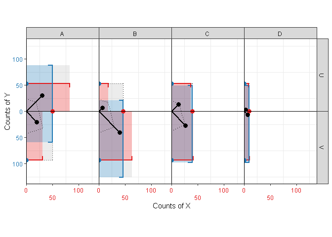
Figure 5: Kite-square plot for a 2x4 matrix, with the binary variable centered.
kitesquare(df_2x4, X, Y, count, fill=TRUE, center=FALSE)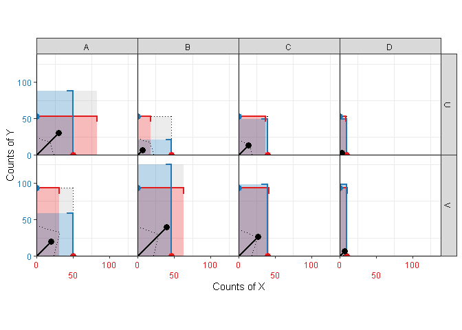
Figure 6: Kite-square plot for a 2x4 matrix, with the binary variable non-centered.
For details and further plotting options, please refer to the
function documentation using ?kitesquare.